Following on from my previous blog post about installing Flex on Windows I thought I would go through how to create an interface using mxml. When you create a Flex 3 project the first file you are given is called Main.mxml, which has the following content.
<?xml version="1.0"?>
<mx:Application xmlns:mx="http://www.adobe.com/2006/mxml">

</mx:Application>
This file is used to compile and run your Flex project and is the central starting point for all the rest of the compile process. This file controls your interface of your program. At first this file might look daunting, but there are lots of elements to select from and if you know CSS then you should be somewhat familiar with how elements are coloured, padded and positioned.
When you compile your application it will create a swf file in the folder called bin. You can compile and run this file from FlashDevelop, but if you want to just compile it you can navigate to this folder and run the swf file separately.
I will now go through some of the elements that you are likely to need to create a simple interface. It is best to get used to the look and feel of your applications before you get into coding so this post will go over simple interface design and the actual actions will be covered in subsequent posts.
Application
The application element must be the root element of your mxml document. It is basically a container for all the other elements of your application.
Label
The label element is used to add some text to your interface and has the following syntax.
<mx:Label text="A label with some text." />
This will produce the following output.

Button
The button is exactly what it sounds like, it just adds a button to your interface. The following creates a button called "abutton" with the text "A button", but which has no action.
<mx:Button id="abutton" label="A button" />
This creates the following element.

Image
Again, the image element is exactly what it sounds like, it adds an image to your application. Here is the syntax.
<mx:Image source="image.jpg" />
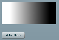
This produces the following output with a simple gradient image.

However, one thing to note is that the source of the image is relative to the path of the swf file in the bin directory. Remember that if you move your swf file you will need to move these files along with it. This took me a while to figure out.
Panel
The panel element is used to contain other elements and create sections in your interface. It is an example of a layout container, which is useful if you want to create a left and right hand panel with different elements in each.
The following example creates a single panel, the full width of the application window, that contains the label, button and image elements that have been previously discussed in this post.
<mx:Panel title="Some example elements" width="100%">
 <mx:Label text="A label with some text." />
 <mx:Button id="abutton" label="A button" />
 <mx:Image source="logo.jpg" />
</mx:Panel>
This produces the following output.

The panel element comes with a fancy set of borders and a header element, if you want to get rid of these then use the following attributes for your panel.
<mx:Panel width="100%"
headerHeight="0"
highlightAlphas="[0, 0]"
borderThicknessTop="0"
borderThicknessLeft="0"
borderThicknessRight="0"
borderThicknessBottom="0"
backgroundAlpha="0"
dropShadowEnabled="false"
cornerRadius="0">
</mx:Panel>
With the addition of the other elements, as in the previous example, this panel now looks like this.

Canvas
The canvas element is like the panel element in that it allows you to add other elements to it and is a layout container. The major difference arises when the elements are rendered. The panel element will stop child elements from overlapping, whereas the canvas element doesn't care and will overlap elements unless you specify x and y coordinates. The following example shows a canvas element that contains a image and a button, both of which are positioned absolutely.
<mx:Canvas width="50%" height="50%" autoLayout="false">
<mx:Image x="0" y="0" source="logo.jpg" />
<mx:Button x="0" y="100" id="abutton" label="A button" />
</mx:Canvas>
This generates the following output.

Spacer
The spacer element is used to provide some space between two elements. It is a blank element that should not contain any children and should be used only to add padding between elements. It has the following syntax, in this case the spacer will create a space of 10 pixels in height.
<mx:Spacer height="10" />
There are plenty of other elements to chose from, and this is only a very brief overview of some of the simpler ones. If you want to know more than check out the Flex 3 API Documentation which has more information on all of the elements discussed here, as well as information on many more which can't all be covered here. However, it should be noted that not all of the things discussed on in the API are interface elements. There are things like the Date object which exists simply to provide a wrapper for date functions and form part of your application script, which I will do an introduction to in my next post.


Comments
Submitted by george on Tue, 02/10/2009 - 19:19
PermalinkAdd new comment