Bar charts are powerful ways to show the relationships between different data items. If the data you want to show is discrete then a simple horizontal segmented bar chart is a good idea. You can easily change a collection of numbers into a related set of attributes.
To display this bar chart you don't need a large JavaScript library or an backend charting system, you just need a few lines of markup and some styles. Here is all of the markup needed to generate the bar chart. This consists of a wrapper element and four inner elements that make up the data of the bar chart. Note that the width of each element is pre-calculated to be 25%. I'll address the maths involved in this later in the post.
<div class="chart">
  <div style="width:25%" class="red start"></div>
  <div style="width:25%" class="blue"></div>
  <div style="width:25%" class="green"></div>
  <div style="width:25%" class="cyan end"></div>
</div>
The aren't a lot of styles involved in this bar chart, in fact, most of the styles are involved with setting the colours of the elements of the chart. What we need to do is set up the width of the wrapper and then float the elements to the left. The width of each element being under a total of 100% means that the chart fits nicely into a single line. The .start and .end classes make the ends of the chart nicely rounded ends.
.chart {
  height: 2rem;
  width: 30rem;
}

.chart div {
  height: 100%;
  float: left;
}

.chart .start {
  border-radius: 2rem 0 0 2rem;
}

.chart .end {
  border-radius: 0 2rem 2rem 0;
}

.chart .red {
  background-color: red;
}

.chart .blue {
  background-color: blue;
}

.chart .green {
  background-color: green;
}

.chart .cyan {
  background-color: cyan;
}
Putting these together produces the following bar chart.

Working Out The Widths
How do we figure out the widths of the elements? This requires a bit of maths to map the elements against a range of the outer wrapper (ie, 100%). Do to this we add all of the elements together and figure out the map of each item against the range of 0 to 100. In the example above we are mapping four equal values to the bar chart, so if we assume that the data is four values of 100 each then the maths works out as follows.
100 + 100 + 100 + 100 = 400
0 + (100 - 0) * ((100 - 0) / (400 - 0))
The mapped value is: 25
I have previously written about creating a mapping function in PHP, and I have also created a tool on this site that allows you to use the mapping function itself. Here is a JavaScript version of the map function previously written in PHP.
function map(value, valueRangeStart, valueRangeEnd, newRangeStart, newRangeEnd) {
  return newRangeStart + (newRangeEnd - newRangeStart) * ((value - valueRangeStart) / (valueRangeEnd - valueRangeStart));
}
This this function we can start looking at dynamically resizing the chart.
Dynamically Sizing The Chart
Whilst adding the widths into the page creates a perfectly usable chart, it does mean we need to work out the sizes before rendering the page. We can solve this by adding in an extra class to each of the chart items. If we add an incrementing class value to each of the chart items we can address each item in the chart using a simple loop. Here is the new markup.
<div class="chart">
  <div style="width:25%" class="item1 red start"></div>
  <div style="width:25%" class="item2 blue"></div>
  <div style="width:25%" class="item3 green"></div>
  <div style="width:25%" class="item4 cyan end"></div>
</div>
Using the width function we can start to make the chart widths a little bit easier to work out. If we keep the widths of the elements at 25% each then we can use some JavaScript code within the page to automatically resize the elements to the desired widths as the page is loaded. The following JavaScript code takes four values of 300, 80, 270, 90 and work out their relative widths. These widths are then applied directly to the chart items using their new incrementing class names.
function map(value, valueRangeStart, valueRangeEnd, newRangeStart, newRangeEnd) {
  return newRangeStart + (newRangeEnd - newRangeStart) * ((value - valueRangeStart) / (valueRangeEnd - valueRangeStart));
}

var chart = document.getElementsByClassName('chart')[0];
var items = [300, 80, 270, 90];

var total = 0;
for (var i = 0; i < items.length; i++) {
  total += items[i];
}

for (var i = 0; i < items.length; i++) {
  let value = Math.floor(map(items[i], 0, total, 0, 100));
  let item = chart.getElementsByClassName('item' + (i + 1))[0];
  item.style.width = value + '%';
}
Although this works, it does cause the chart to flicker after the new widths have been applied to the elements. To make the transition a little easier for the user we can add a couple of new styles to the CSS so that the transition is animated.
.chart div {
  height: 100%;
  float: left;
  transition-property: width;
  transition-duration: 0.5s;
}
If you want to see of this code in action then I have created a codepen project with everything you need.
Making It Fully Dynamic
Taking it a step further it is possible to create a fully dynamic chart by adding a few more lines of JavaScript. This means that instead of being restricted to four items we can add as many items as we need. The first thing we need to do is remove the inner markup so that we can add in the chart items needed.
<div class="chart">
</div>
As we will be generating the inner components of the chart with all of the needed styles we can remove much of the existing styles for the chart. The chart CSS is now just a few rules.
.chart {
  height: 2rem;
  width: 30rem;
}

.chart div {
  height: 100%;
  float: left;
  transition-property: width;
  transition-duration: 0.5s;
}

.chart .start {
  border-radius: 2rem 0 0 2rem;
}

.chart .end {
  border-radius: 0 2rem 2rem 0;
}
The new JavaScript code just needs to loop through the data we provide and create each item as the map is worked out. That item is then added to the chart, along with the needed styles to set a colour and correct width. A couple of if statements are also used to add extra classes for the start and end items in the chart.
function map(value, valueRangeStart, valueRangeEnd, newRangeStart, newRangeEnd) {
return newRangeStart + (newRangeEnd - newRangeStart) * ((value - valueRangeStart) / (valueRangeEnd - valueRangeStart));
}
var chart = document.getElementsByClassName('chart')[0];
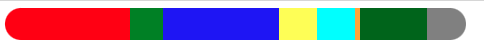
var items = [300, 80, 270, 90, 100, 20, 160, 100];
var colours = ['red', 'green', 'blue', 'yellow', 'cyan', 'orange', 'darkgreen', 'grey'];
var total = 0;
for (var i = 0; i < items.length; i++) {
total += items[i];
}
for (var i = 0; i < items.length; i++) {
let value = Math.floor(map(items[i], 0, total, 0, 100));
const item = document.createElement('div');
item.style.width = value + '%';
item.style.backgroundColor = colours[i];
if (i == 0) {
item.classList.add('start');
}
if (i == items.length - 1) {
item.classList.add('end');
}
chart.append(item);
}
This code generates the following bar chart. The only limitation in this is the number of colours that are in the colours array as this currently dictates the length of the data items that can be shown. You can either increase the number of colours or simply loop around to the start of the colours list once the end is reached.
If you want to see the JavaScript generated bar chart in action then I have created a codepen project for that as well. Feel free to use this in your own projects.
What is missing from the above examples is the actual figures of the bar chart and some kind of label to show what the colours are. This is an important part of the chart as it will show what numbers belong to what colours. I will leave as an exercise for the reader as it all it needs is a table or an ordered list with some background colours applied.
Update 30/06/2022:
The border-radius style is better defined like this.
.chart .start {
    border-top-left-radius: 1.5rem;
    border-bottom-left-radius: 1.5rem;
}

.chart .end {
    border-top-right-radius: 1.5rem;
    border-bottom-right-radius: 1.5rem;
}
This format will allow one element to be the start and the end without one radius overwriting the other.

Comments
The calculation shown in "Working out the widths" evaluates to -400.
It should be: 0 + (100 - 0) * ((100 - 0) / (400 - 0)) instead!
Submitted by M on Thu, 12/16/2021 - 15:28
PermalinkYou are right! Thanks for the correction, I've updated the calculation.
Submitted by philipnorton42 on Thu, 12/16/2021 - 15:54
PermalinkAdd new comment