The Python Tkinter module has a lot of widgets built in that provide different parts of the graphical user interface. Everything from labels to buttons are all widgets and they extend from the base Widget class. Some Widgets are easy to put together, but others require a little bit of configuration to get working. This article will show each Tkinter widget available and how to add each one to an application.
There are two sorts of Widgets available. Simple widgets exist in their own right, but some widgets are made to contain other widgets.
Simple Widgets
These are widgets that can be added to the interface on their own and provide functionality or information to the user. Here is an alphabetical list of simple widgets available in Tkinter.
Button
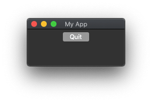
The Button widget creates a button that can process an interaction made by the user. The command argument accepts a callback that points to a method that will be called when the user clicks the button.
import tkinter as tk

app = tk.Tk()
app.title("My App")
app.geometry("200x75")

def quitCommand():
    quit()

button = tk.Button(text="Quit", command=quitCommand)
button.pack()

app.mainloop()
This code will generate the following application.
Canvas
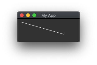
The Canvas widget is a rectangular area that is used to draw shapes, write text, or embed images. They can also accept other widgets and frames in order to create more complex layouts. Canvas widgets can be useful when drawing images or even creating games. They are complex widgets that contain many options and methods to control their structure.
import tkinter as tk
from tkinter import Canvas

app = tk.Tk()
app.title("My App")
app.geometry("200x75")

canvas = Canvas(app)
canvas.create_line(10, 10, 150, 50)
canvas.pack()

app.mainloop()
This code will generate the following application.
Checkbutton
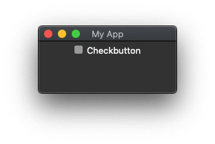
The Checkbutton widget allows a simple on/off widget to be created that will allow a user to make a two way choice. The widget can be in either an off or and on state and is off by default. This type of form item is often called a checkbox.
import tkinter as tk

app = tk.Tk()
app.title("My App")
app.geometry("200x75")

checkbutton = tk.Checkbutton(text="Checkbutton")
checkbutton.pack()

app.mainloop()
This code will generate the following application.
Entry
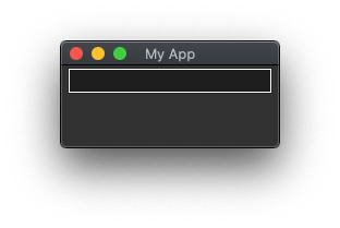
An Entry widget allows users to enter textual information into the program, which can then be read to perform whatever action is needed. This is essentially the basic text entry widget that exists on a lot of forms.
import tkinter as tk

app = tk.Tk()
app.title("My App")
app.geometry("200x75")

entry = tk.Entry()
entry.pack()

app.mainloop()
This code will generate the following application.
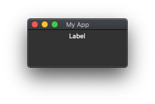
Label
The Label widget is simply a label that can be placed onto the form to add context to other widgets. In its simplest form the label simply shows some text.
import tkinter as tk

app = tk.Tk()
app.title("My App")
app.geometry("200x75")

label = tk.Label(text="Label")
label.pack()

app.mainloop()
This code will generate the following application.
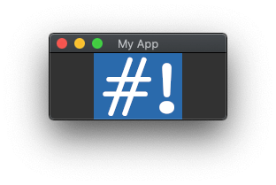
Label (With Image)
The Label widget can also be used to show an image. This acts in the same way as the text version of the Label, but instead contains an image. To produce this effect a local image needs to be created using the PhotoImage() class, which also comes with the Tkinter module. This PhotoImage instance is then passed to the label.
import tkinter as tk

app = tk.Tk()
app.title("My App")
app.geometry("200x75")

# Load the image into an object.
img = tk.PhotoImage(file='hashbangcode_logo.png')

# Add a label with the image.
label = tk.Label(app, image=img)
label.pack()

app.mainloop()
This code will generate the following application.
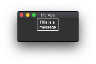
Message
The Message widget is very similar to the Label widget. The main difference is that the Message widget will format and justify the text it contains correctly. The idea is that the Message widget can have its text altered whilst the program is being used and is therefore able to adapt to the text changes made to it.
import tkinter as tk

app = tk.Tk()
app.title("My App")
app.geometry("200x75")

message = tk.Message(text="This is a message", relief=tk.SUNKEN)
message.pack()

app.mainloop()
This code will generate the following application.
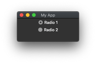
Radiobutton
A radio button is a button that allows a single option to be selected from a list of items. The Radiobutton widget provides this functionality in Tkinter programs. There is a little bit of setup involved as the Radiobutton widgets you have in the program need to understand that they are part of the same selectable group.
import tkinter as tk

app = tk.Tk()
app.title("My App")
app.geometry("200x75")

variable = tk.IntVar()
variable.set(1)

radiobutton1 = tk.Radiobutton(app, text="Radio 1", variable=variable, value=1)
radiobutton1.pack()

radiobutton2 = tk.Radiobutton(app, text="Radio 2", variable=variable, value=2)
radiobutton2.pack()

app.mainloop()
This code will generate the following application.
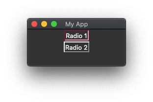
Radiobutton Using Alternate Styles
It is also possible to give a Radiobutton a different look by setting the indicatoron setting in the widgets setup. This turns the radio buttons into actual buttons, of which only one can be selected at a time.
import tkinter as tk

app = tk.Tk()
app.title("My App")
app.geometry("200x75")

variable = tk.IntVar()
variable.set(1)

radiobutton1 = tk.Radiobutton(app, text="Radio 1", variable=variable, value=1, indicatoron=False)
radiobutton1.pack()

radiobutton2 = tk.Radiobutton(app, text="Radio 2", variable=variable, value=2, indicatoron=False)
radiobutton2.pack()

app.mainloop()
This code will generate the following application.
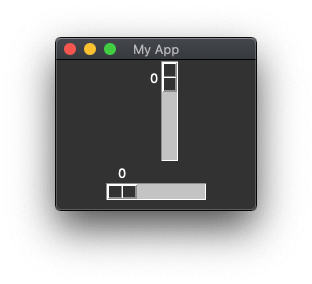
Scale
The Scale widget is used to allow the input of a number by using a sliding element. By default the Scale widget allows users to select a number between 0 and 100, but this can easily be configured to be a different range.
The Scale widget can have a vertical or horizontal orientation, which is controlled by the orient configuration property.
import tkinter as tk

app = tk.Tk()
app.title("My App")
app.geometry("200x150")

scale = tk.Scale()
scale.pack()

scale = tk.Scale(orient=tk.HORIZONTAL)
scale.pack()

app.mainloop()
This code will generate the following application.
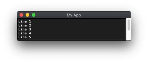
Scrollbar
The Text widget (see below) can contain text content. If this content gets too long it can be coupled with a Scrollbar widget to allow the content of that widget to be scrolled. Scrollbar widgets can also be coupled with a Canvas widgets to provide a scrollable canvas area.
import tkinter as tk

app = tk.Tk()
app.title("My App")

text = tk.Text(height=5,width=50)
text.grid(row=0, column=0, sticky='ew')

scrollbar = tk.Scrollbar(command=text.yview)
scrollbar.grid(row=0, column=1, sticky='ns')

text['yscrollcommand'] = scrollbar.set

app.mainloop()
This code will generate the following application.
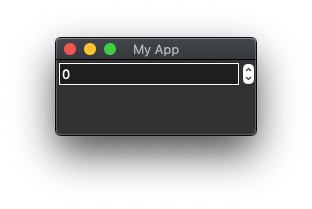
Spinbox
A Spinbox widget is used to allow the user to enter a numeric value with an upper and lower limit. It acts like a number field on a HTML form element as it has little up and down arrows to change the value without having to type it.
import tkinter as tk

app = tk.Tk()
app.title("My App")
app.geometry("200x75")

spinbox = tk.Spinbox(from_=0,to=50)
spinbox.pack()

app.mainloop()
This code will generate the following application.
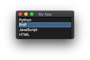
Listbox
Listbox widgets allow a user to select an item from a list, normally a list of text items. By default, the user can only select a single item, but this can be changed using the selectmode configuration option.
import tkinter as tk

app = tk.Tk()
app.title("My App")
app.geometry("200x75")

listbox = tk.Listbox()
listbox.insert(1, "Python")
listbox.insert(2, "PHP")
listbox.insert(3, "JavaScript")
listbox.insert(4, "HTML")
listbox.pack()

app.mainloop()
This code will generate the following application.
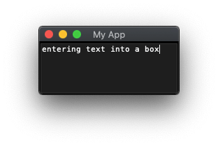
Text
The Text widget is similar to the Entry widget, but here it allows multiple lines of text to be added. By default, the Text widget doesn't have a scroll bar so it needs to be coupled with a Scrollbar widget to allow this.
import tkinter as tk

app = tk.Tk()
app.title("My App")
app.geometry("200x75")

text = tk.Text()
text.pack()

app.mainloop()
This code will generate the following application.
Grouping Widgets
These are widgets that contain other widgets. They generally have no functionality of their own, but can be used to create areas of the application where buttons, labels, entry fields and other widgets are added to move them into a separate section.
Here is an alphabetical list of simple widgets available in Tkinter.
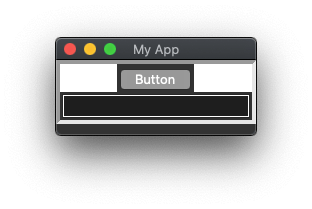
Frame
The Frame widget is the simplest grouping widget as it just creates a separate area for widgets to be held in. The border of the frame can be changed with the bd and relief configuration items. The background of the frame can also be set with the bg configuration setting.
import tkinter as tk

app = tk.Tk()
app.title("My App")
app.geometry("200x75")

frame = tk.Frame(app,bg="white",relief=tk.SUNKEN,bd=4)
frame.pack()

button = tk.Button(frame, text="Button")
button.pack()

entry = tk.Entry(frame)
entry.pack()

app.mainloop()
This code will generate the following application.
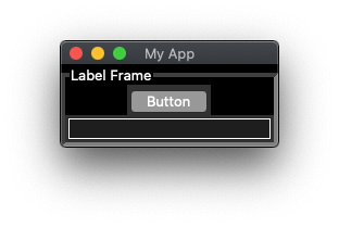
LabelFrame
The LabelFrame widget is an extension of the Frame widget with the addition of a label at the top of the frame. The text of the label is set using the text configuration setting.
import tkinter as tk

app = tk.Tk()
app.title("My App")
app.geometry("200x75")

labelframe = tk.LabelFrame(app,text="Label Frame",bg="black",relief=tk.SUNKEN,bd=4)
labelframe.pack()

button = tk.Button(labelframe, text="Button")
button.pack()

entry = tk.Entry(labelframe)
entry.pack()

app.mainloop()
This code will generate the following application.
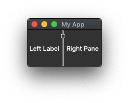
PanedWindow
A PanedWindow widget is a resizable area that can be resized with other PanedWindows placed next to it.
By default, the border between the two panes and the handle are hidden from view. The border between the two panes can be shown by adding the sashrelief configuration item, and the showhandle configuration item shows the handle for resizing the pane.
import tkinter as tk

app = tk.Tk()
app.title("My App")
app.geometry("150x75")

panedwindow = tk.PanedWindow(showhandle=True,sashrelief=tk.SUNKEN)

leftLabel = tk.Label(panedwindow, text="Left Label")
panedwindow.add(leftLabel)

rightLabel = tk.Label(panedwindow, text="Right Pane")
panedwindow.add(rightLabel)

panedwindow.pack(fill=tk.BOTH, expand=True)

app.mainloop()
This code will generate the following application. The line in the middle can be moved left and right to resize the pane.
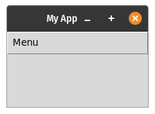
Menu
The Menu widget is used to create an application menu for the program. The widget is created by nesting Menu widgets inside each other to form a hierarchy of menu items. The widget is placed into the application using a slightly different method from all other widgets. The menu needs to be added using the configuration of the application itself, which is set using the config() method.
import tkinter as tk

def quitCommand():
    quit()

app = tk.Tk()
app.title("My App")
app.geometry("200x75")

menubar = tk.Menu(app)
app.config(menu=menubar)

submenu = tk.Menu(menubar)
submenu.add_command(label="Quit", command=quitCommand)

menubar.add_cascade(label="Menu", menu=submenu)

app.mainloop()
This code will generate the following application on a Linux system, the menu is embedded into the application window.
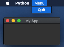
When running on a Mac the menu widget will appear at the very top of the screen. This is standard for Mac applications but can be tricky to spot.
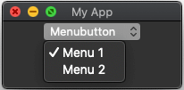
Menubutton
If you want to embed a drop down menu into the application then using the Menubutton widget will allow this. To use this widget you need to create the Menutbutton widget and then inject a Menu widget into it.
import tkinter as tk

app = tk.Tk()
app.title("My App")
app.geometry("200x75")

menubutton = tk.Menubutton(text="Menubutton")
menubutton.pack()

menu = tk.Menu(menubutton, tearoff=False)
menu.add_radiobutton(label="Menu 1")
menu.add_radiobutton(label="Menu 2")

menubutton['menu'] = menu

app.mainloop()
This code will generate the following application.
That's it for the core widgets in the Tkinter module. There are more widgets available as part of the Tkinter themed widgets (aka, ttk), but as these are separate to the core I haven't shown them in use here.


Mandy